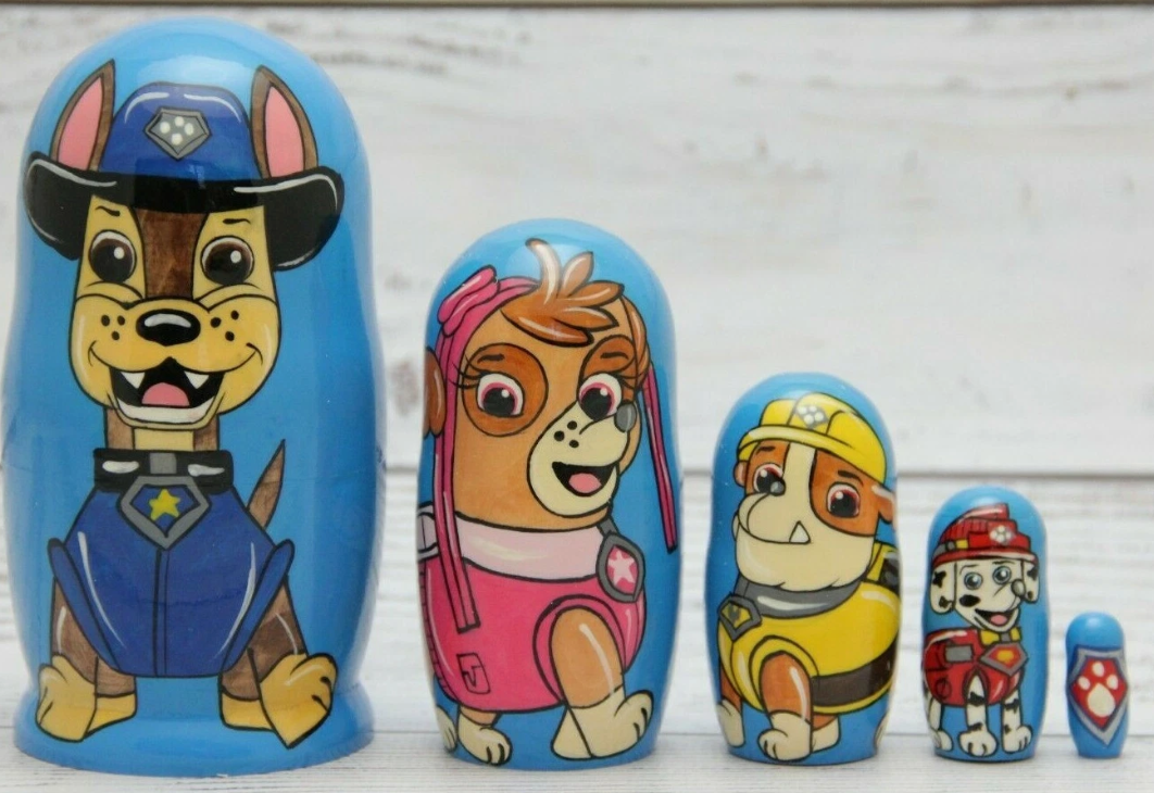
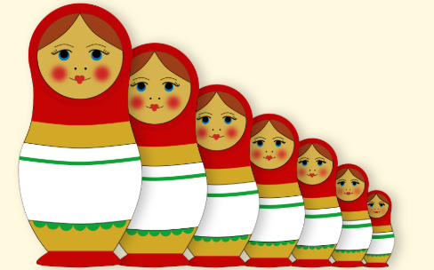
The project’s goal was to showcase the artist’s (Tracey Vergara a.k.a. me) drawing skills throughout
his life as he grew up. By taking the concept of the Russian nesting dolls, showcasing this evolution
was possible by starting with his current self, down to his childhood-self. Additionally, I am drawn to
cool and conceptual designs, therefore the Russian nesting dolls were the ideal thing for this personal
project.
For this project, I was responsible with all the research, design and technical aspects - from the
idea, sketches, digital illustrations, as well as the printing and assembling of the said “dolls”.
This project was given 1-2 months before the event of Vernissage and it was up to me to manage the
different elements of my personal project – research, colours, designs, illustrations, printing,
etc.…
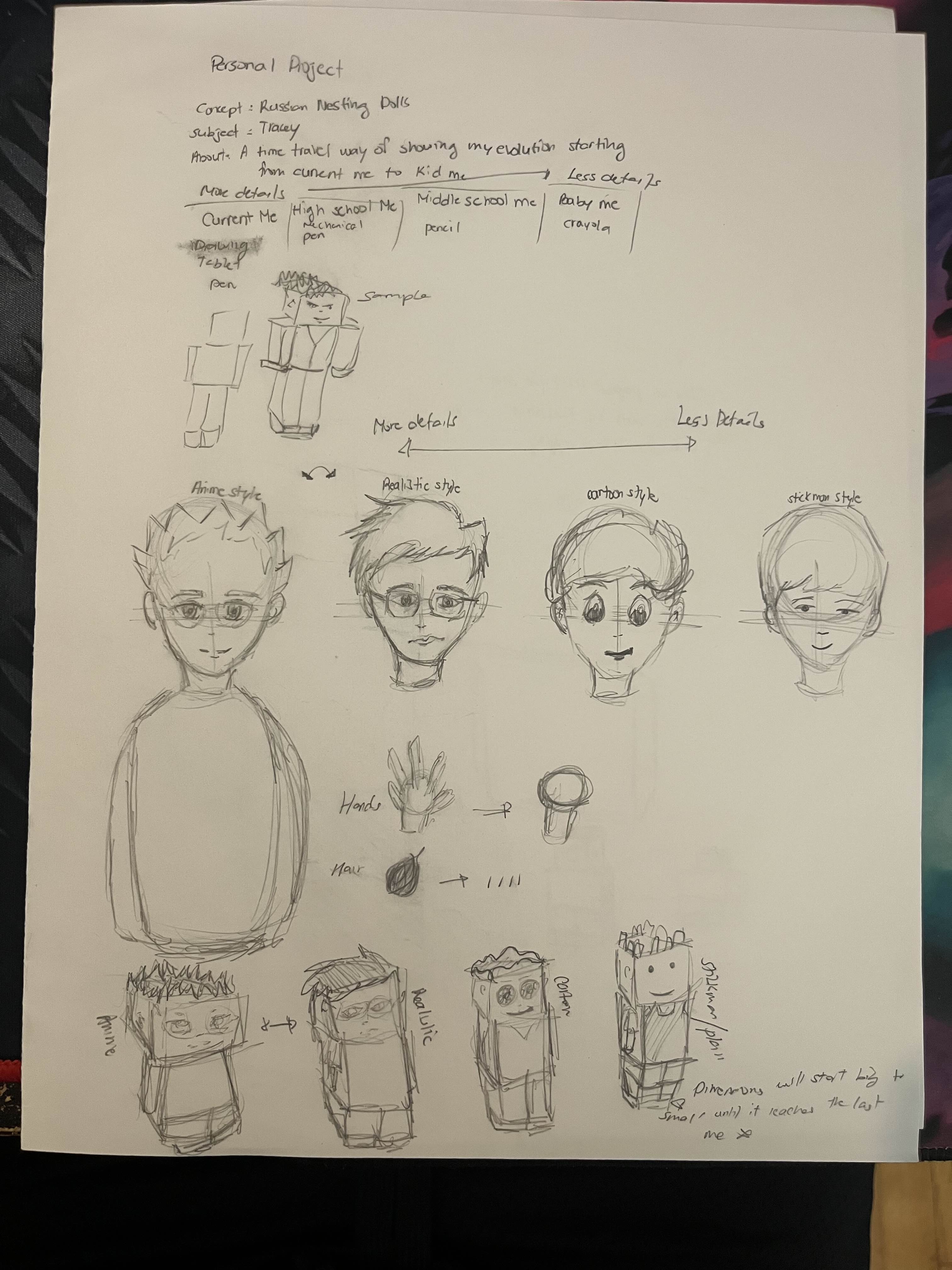
The design challenge I had for this project was remembering how I used to draw in my early days as
an artist because most of the drawings that I had were hidden somewhere in my room, but I managed to
find some and thanks to my memories and past pictures available, I remembered how I used to draw.
Additionally, I also had to find the right paper quality to print the illustrations as I had to make
sure that they were durable enough when it was time to fold and stick them in place. Making sure the
measurements were accurate also proved to be a little difficult as I did not want the smallest
“doll” to be small enough that it would be hard to put it together. Hence, lots of thoughts and calculations
were considered. At the same time, I also had technical difficulties around the software I was using to draw, as it seemed to be glitchy at times,
and it would even crash my laptop. Unsaved work was infuriating but thankfully it did not happen too much to the
point of losing patience. Another challenge would be the actual concept of how I would bring my project to life.
Looking at Russian Nesting Dolls, most of them are round and I was not too familiar in making 3D objects.
Therefore, I had to find an alternative on how to develop them.
The target audience is everyone as I want people to know how my art style changed over the course of
my life, and some design choices include having little to no details on the smallest “doll” to having
colour gradients and cloth folds on the biggest “doll”, hence the details.
To make this personal project possible, I looked at existing Russian nesting dolls online and how
they generally work. As for the different Tracey throughout time, I would remember how I used to draw and
how my fashion choices would look back in the days and apply them in the project.
Here are some images that I took as my inspiration and concept exploration on the days of this
personal project.
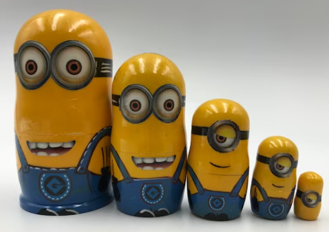
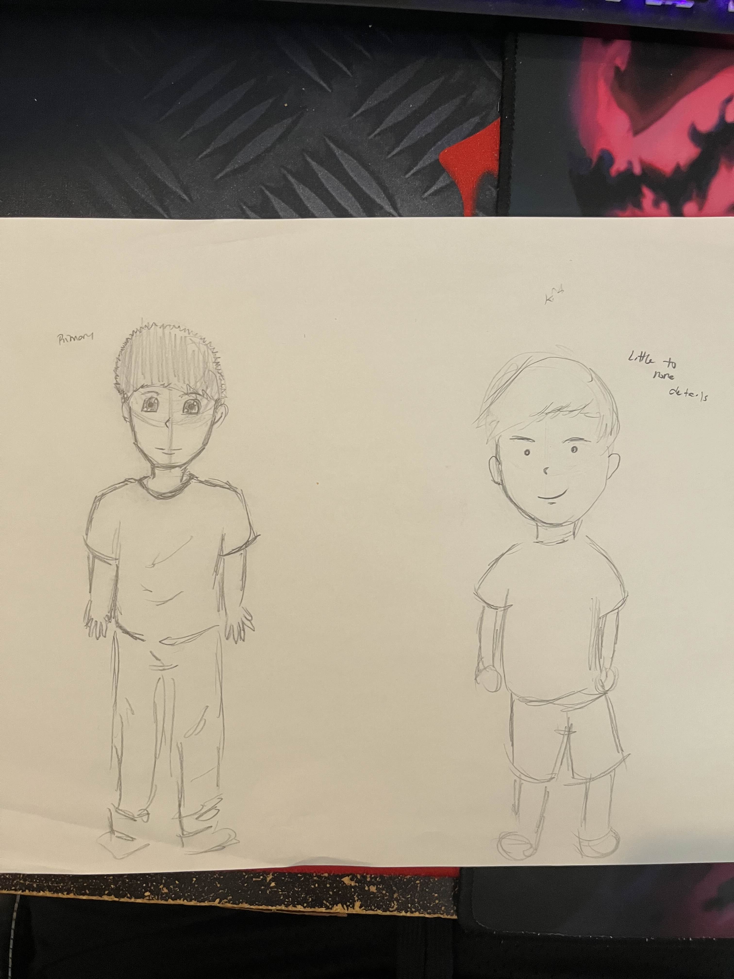
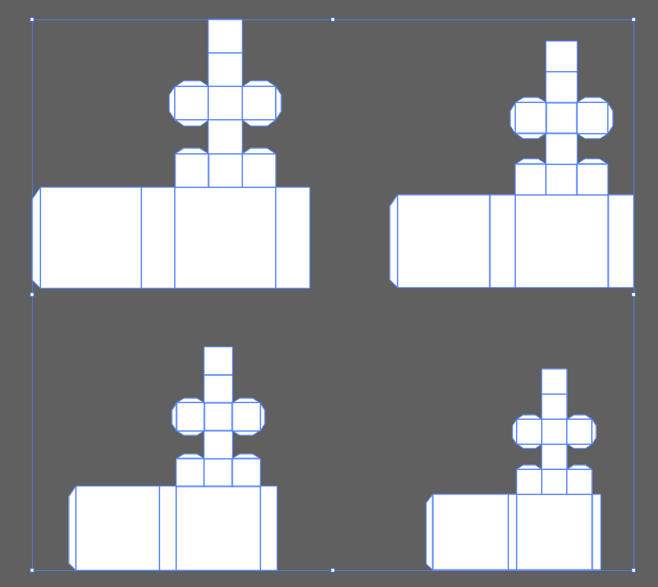
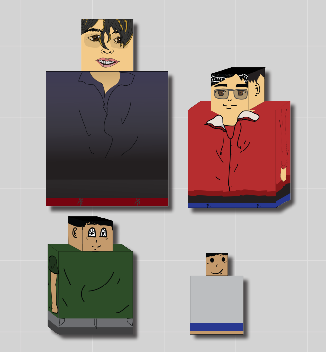
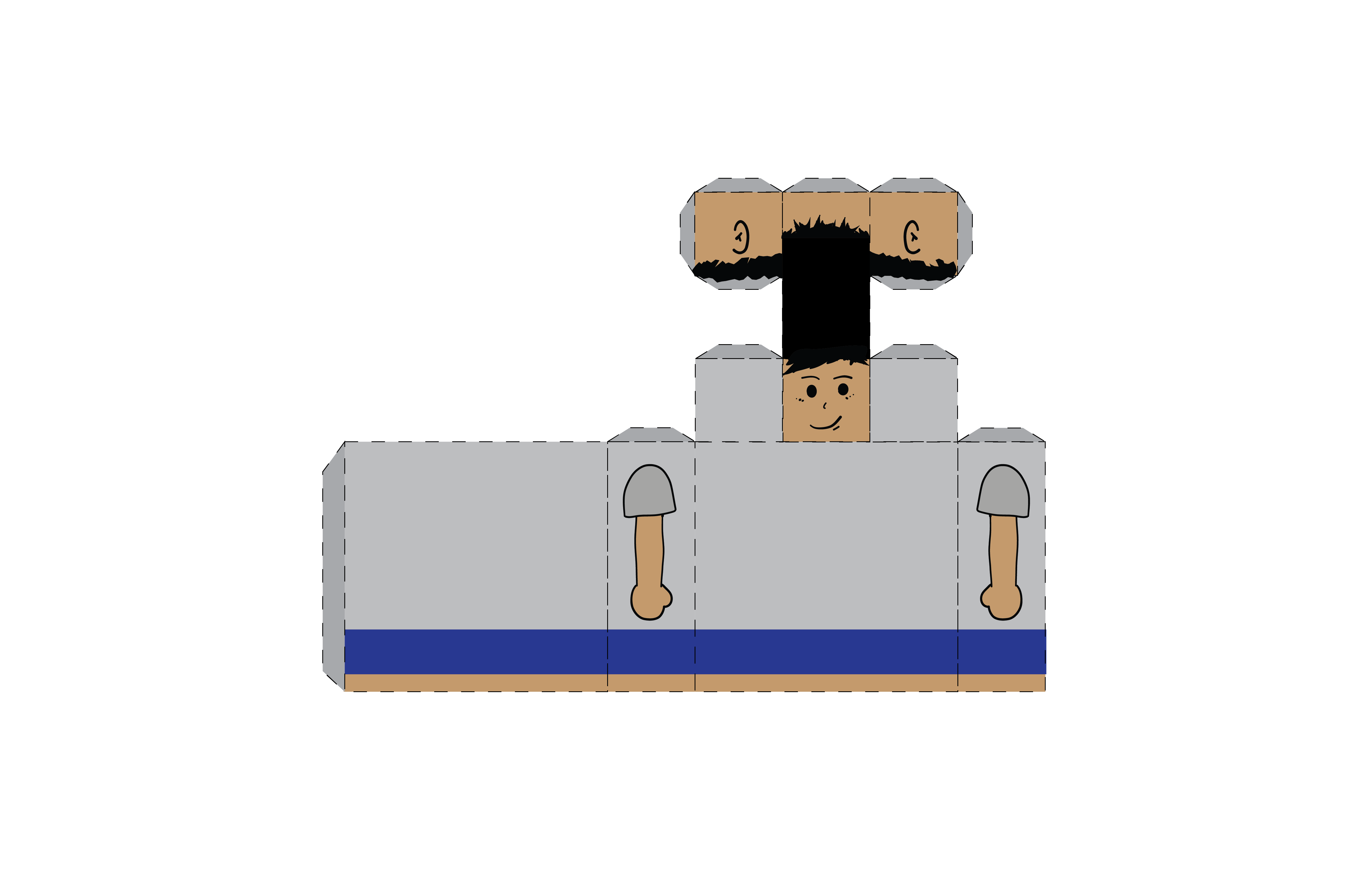
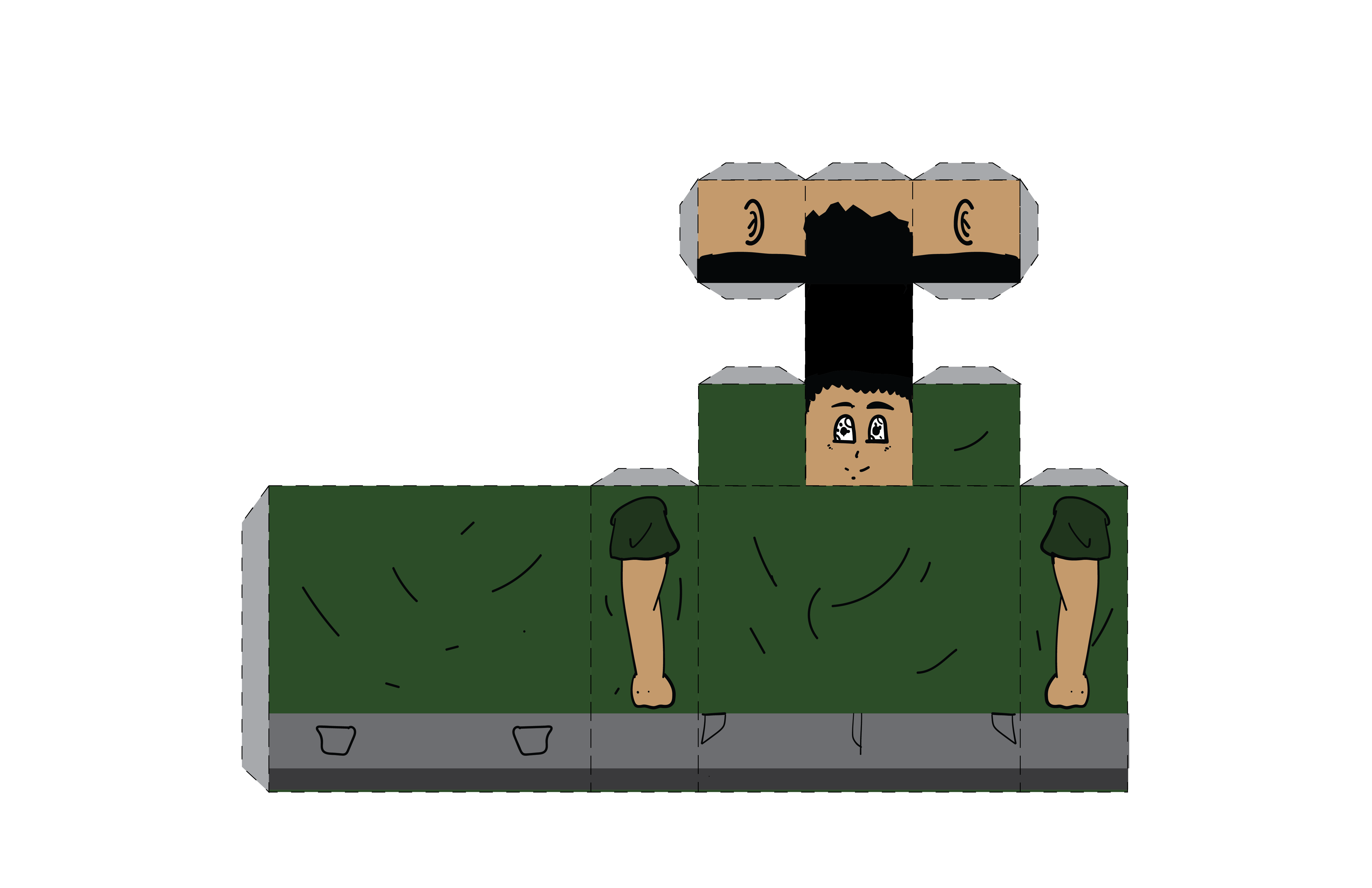
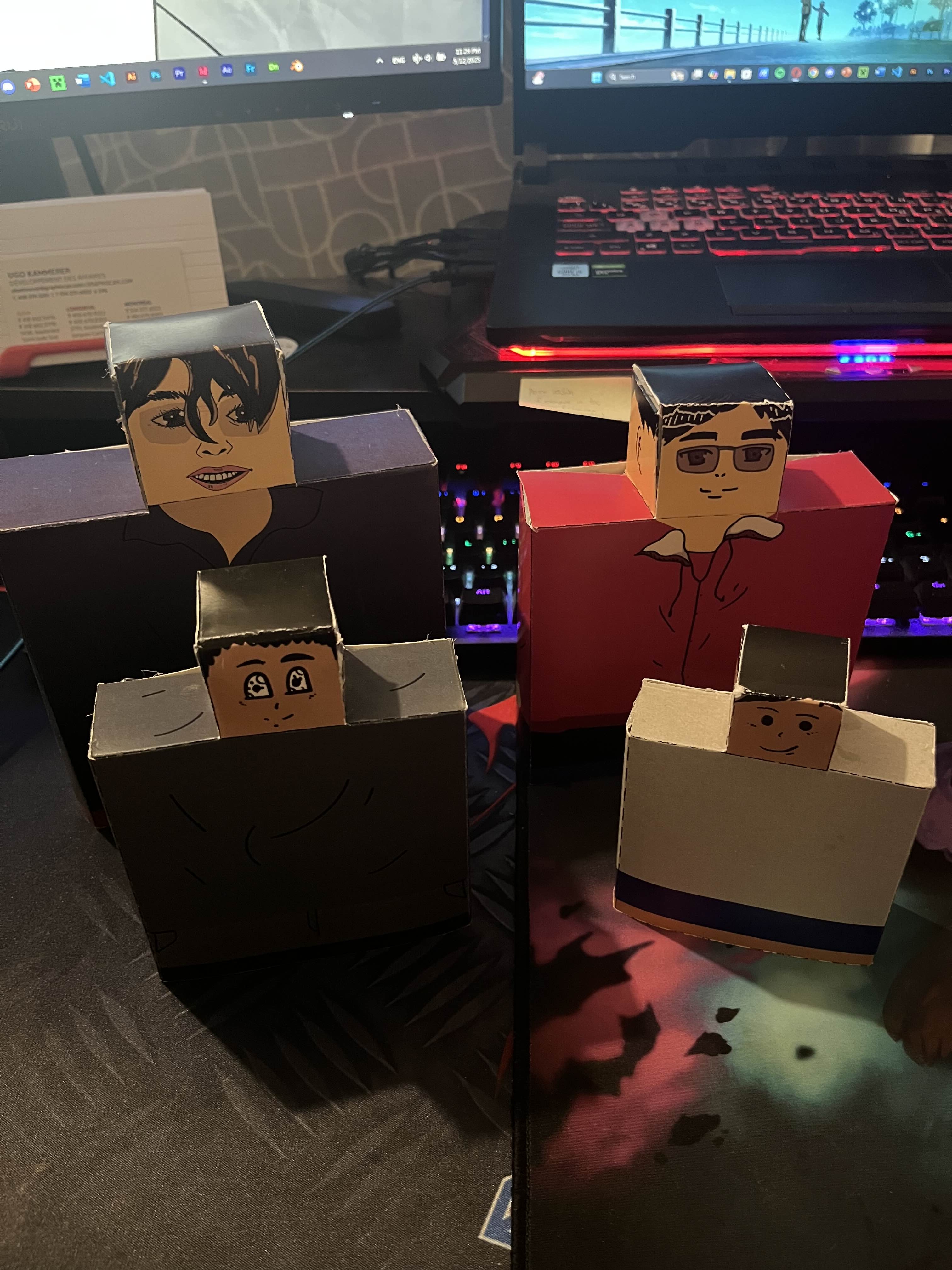
The smallest “doll” represents myself as a kid around 4-6 years old, I had a very simplistic drawing
style, and I did not pay too much attention to detail as it did not seem to be relevant at that
early stage of my childhood development. Most of my drawings were shapes and lines as I was just starting
out being an artistic person. I also used to wear lots of plain white and grey clothes back in the days
and I liked being barefoot, especially when playing outside with friends.
The second stage of “me” was around the age of 7 to 12 years old, my drawing style evolved in having
a cartoonish style – having rounded eyes with more life to them and I know how to add general fabric
wrinkles. At that age, I watched a lot of cartoon shows, which probably influenced my drawing style.
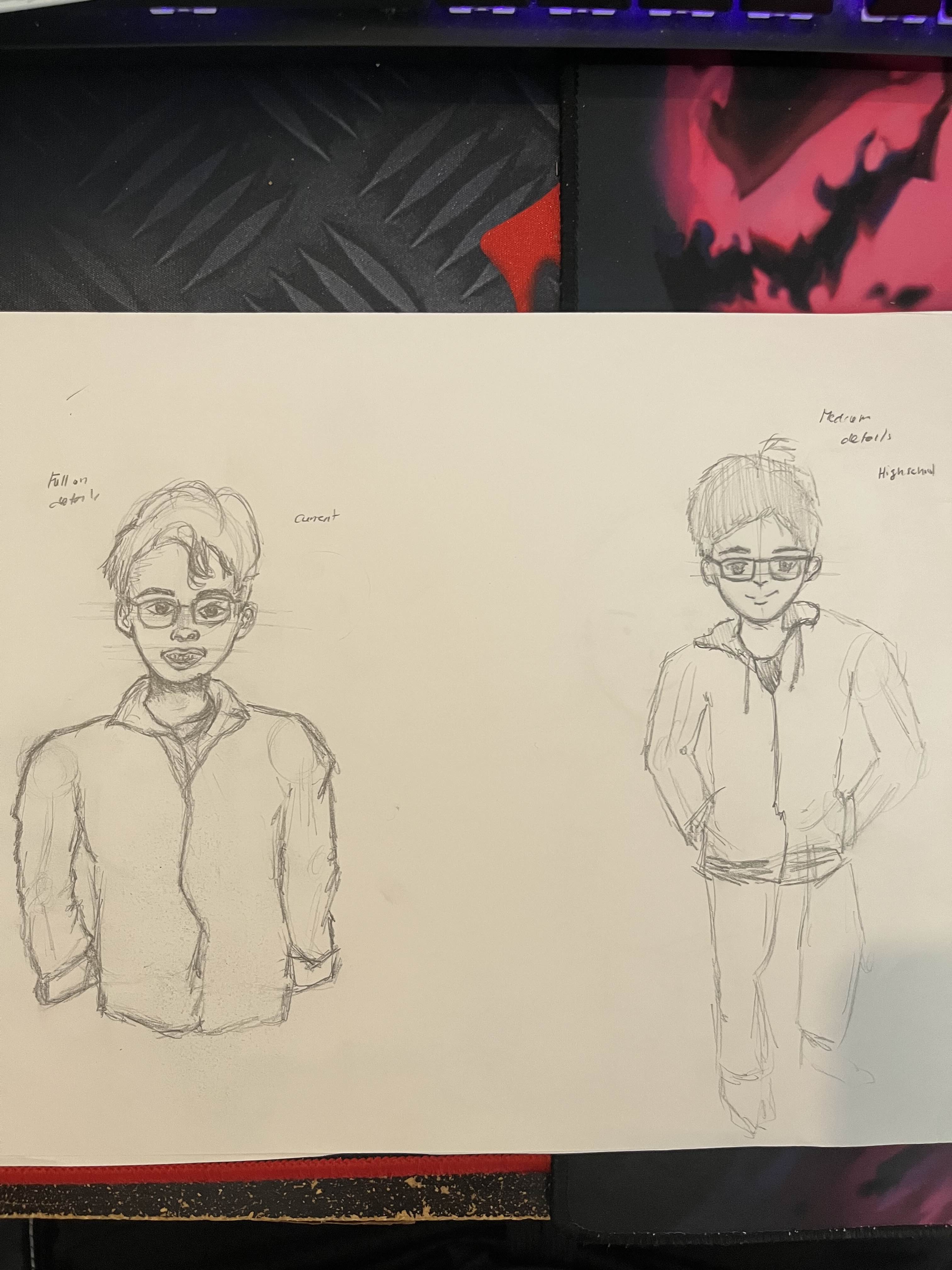
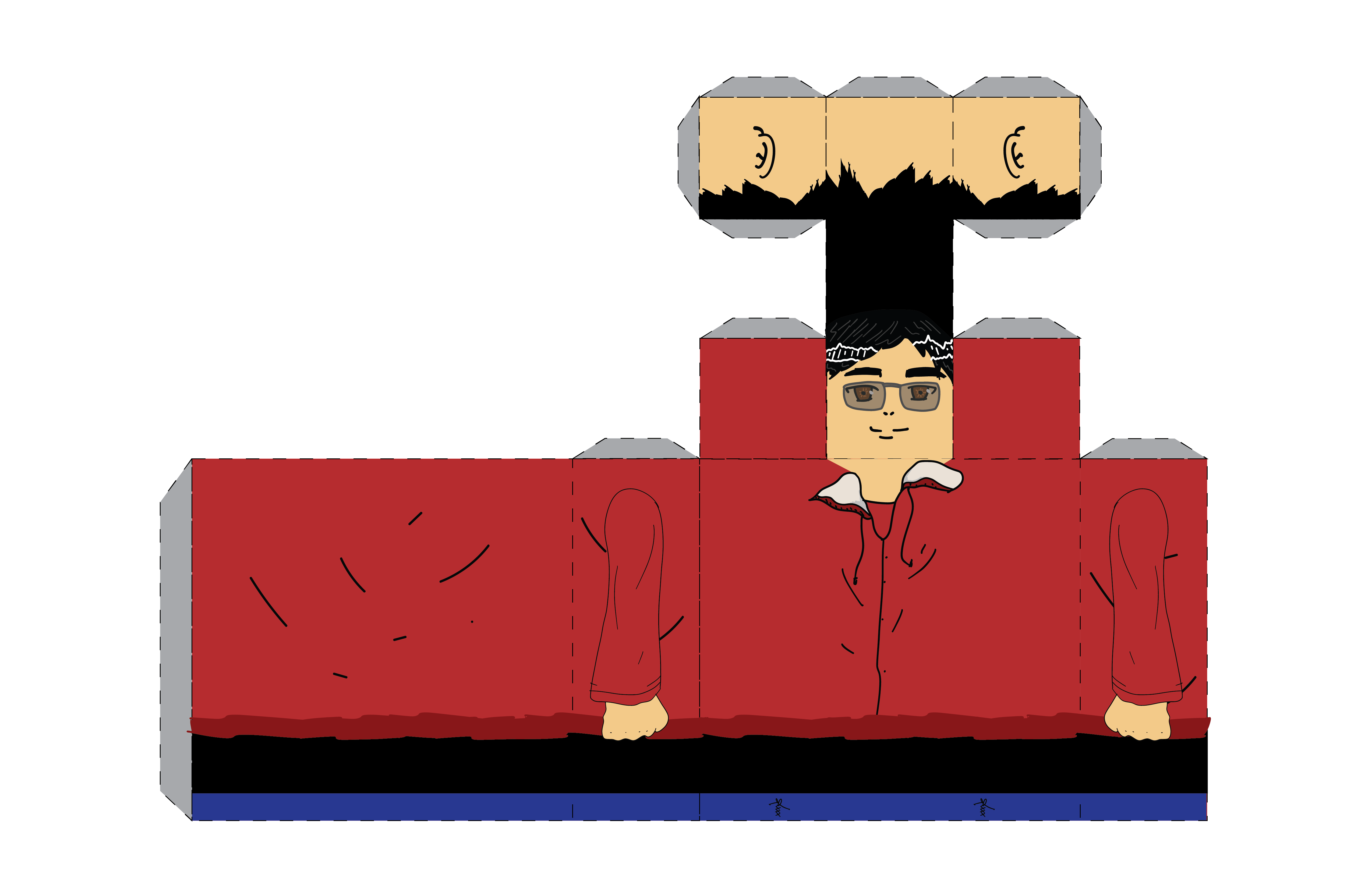
The third stage would be my teenager version (13-19 years old). My drawing style developed further
in terms of having more details in them and making sure to pay attention to specifics like eyes, folds,
fabric wrinkles. As a teenager, I developed a passion for fashion as I would often dress up in ways
that I thought was trendy and “cool”. I explored lots of different hair styles and clothes, and I found
that red was my favourite colour. This was also the time that I developed myopia, hence the glasses, and
my drawing styles were influenced by my intense interest in watching Japanese anime.
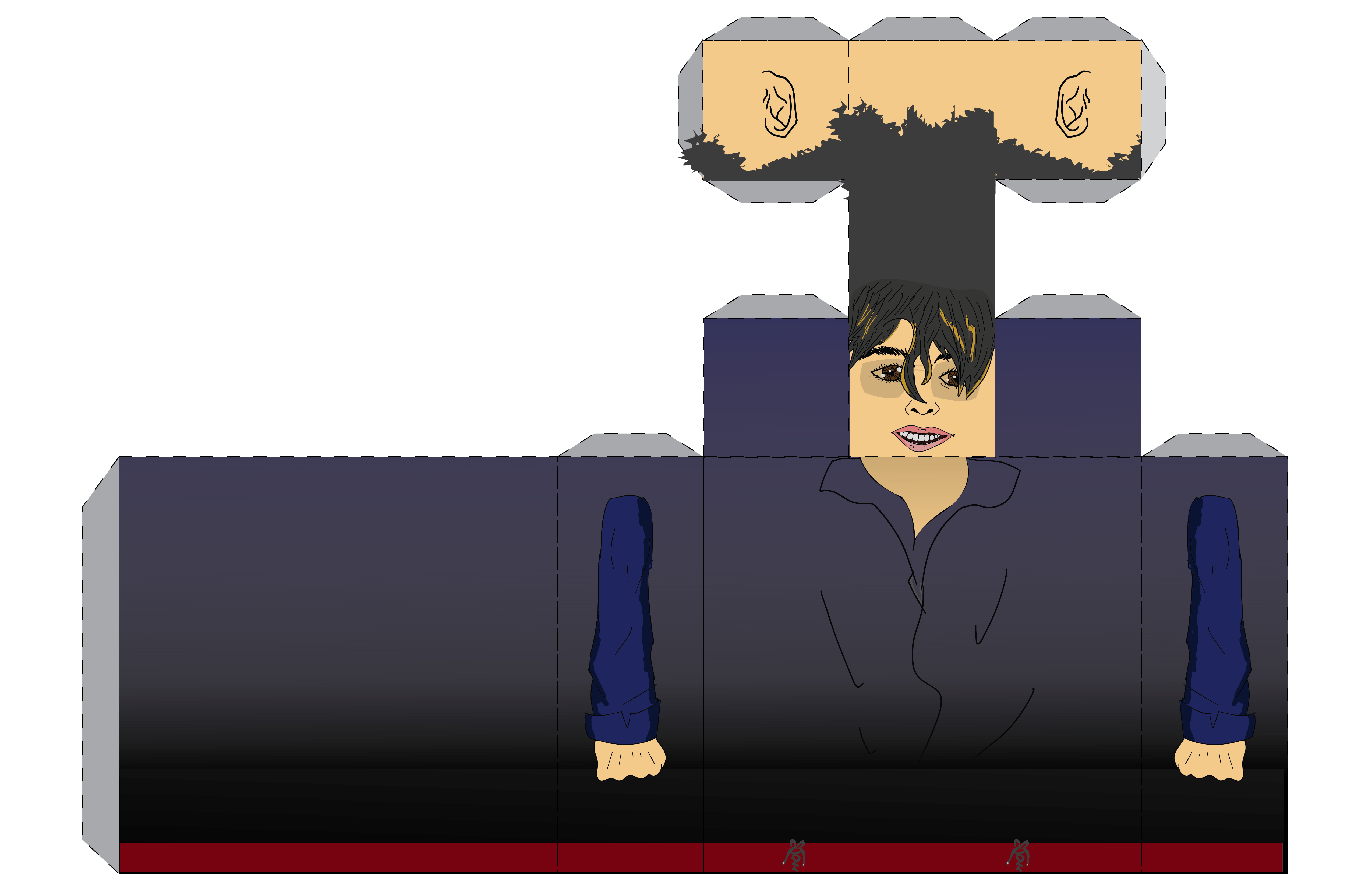
Finally, the last “doll” represents the current Tracey as I now practice realistic arts, and I now
know the importance of shading and gradients around objects. In the actual “doll”, there are more details
in the face, hair and overall colours. Good art takes time, therefore when I am drawing something
realistic, it would take time until it is complete – the kind of patience that I did not have during
my early days as an artist because I always wanted to finish on the same hour/day that I started
drawing.
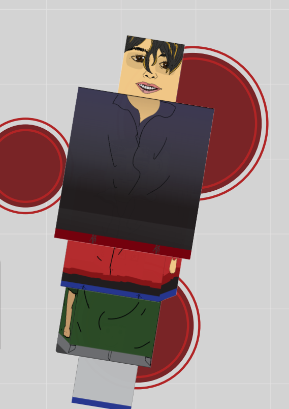
This conceptual project works well in terms of showing my evolution by lifting each “doll” –
revealing past versions of both myself and drawing skills. The current “me” is also the first thing you see
instead of being the youngest “me” as a way to remind myself my current progress in drawing.
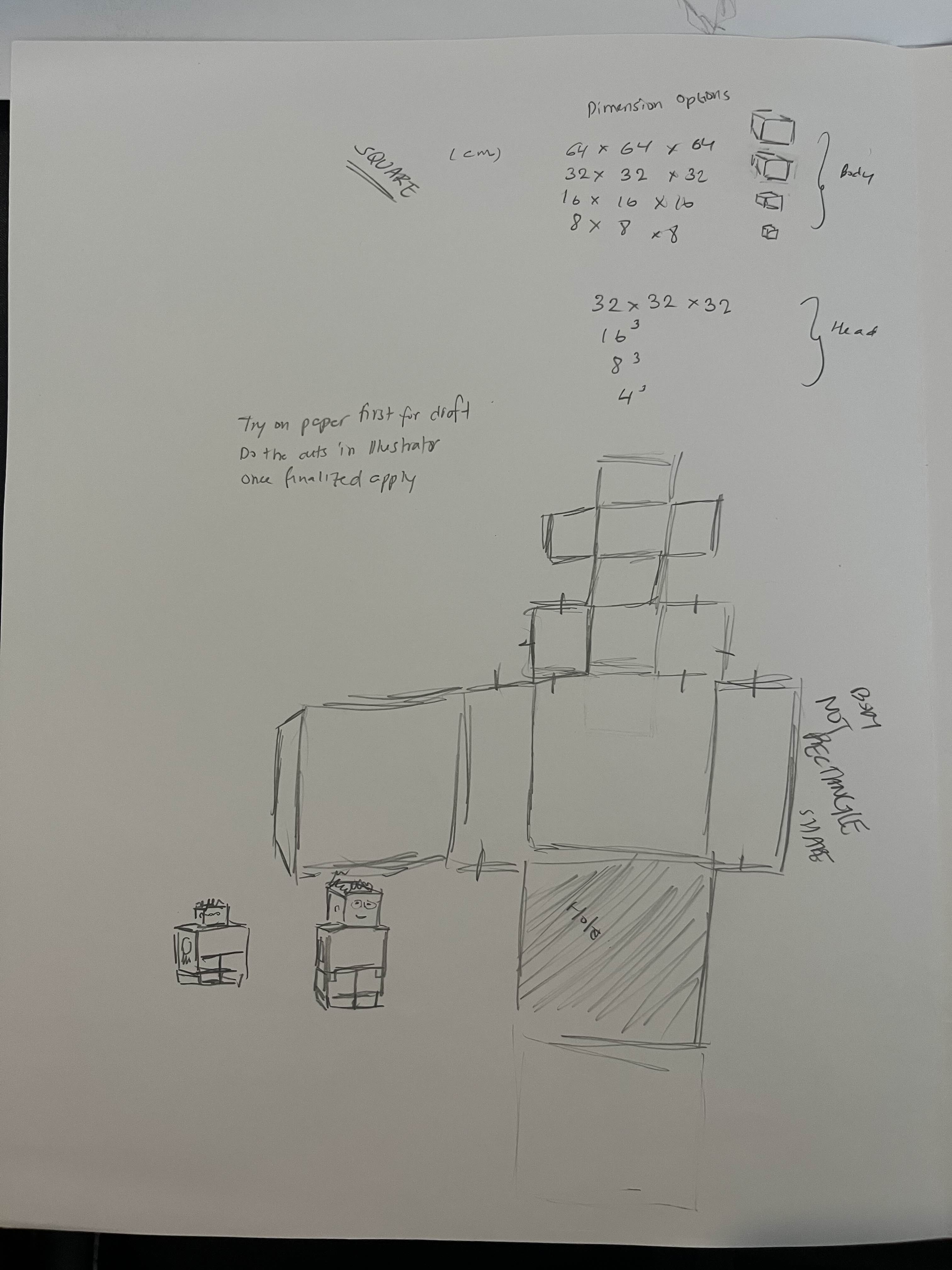
For this project, I used Adobe Illustrator to set up the unmade packaging of the “doll” and as for the illustrations itself, I used Adobe Fresco, and I would export them in Illustrator so that they go in their respective space. I had to draw the different versions of myself in a paper like how I would normally draw before putting each part of the body in Adobe Illustrator to make sure I had all the necessary requirements.
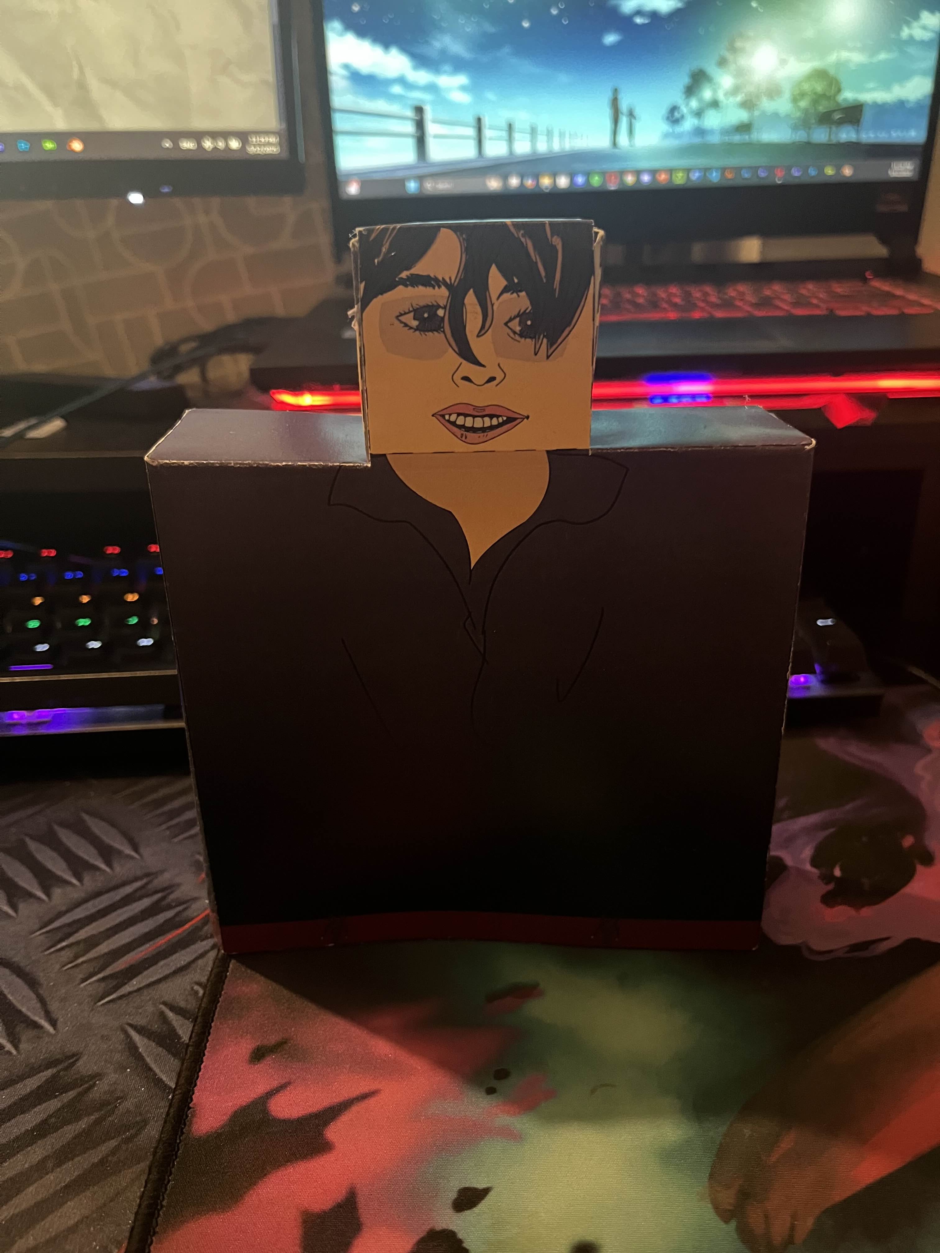
The drawing quality was central to the project for each “doll” because it represented my level as an artist, and finding and remembering how I used to draw helped with the development of this project. Additionally, they can stand without falling because the paper quality was good, making the concept a success. The overall design and colours of the project also stood out in the final design. The geometric dolls worked well as nesting dolls because they can be stacked together because of the hole at the bottom, therefore the measurements were just perfect enough. To stick them together in place, I made sure to have enough extra folds intended for sticking and it worked.
Overall, I liked the outcome of this personal project as it meant a lot to me in terms of seeing my
evolution and the design concept looked awesome. My peers and teachers also share the same
sentiments as me, finding the project both interesting and comical, in a good way.
During Vernissage, the people who came to see my work particularly took interest in my version of a
nesting doll as it was unique in the room and I believe it was never done before. This got people’s
attention and sparked conversations with me.
For this project, I learned that assembling and folding the “dolls” were not easy as they would
sometimes not stick if you used regular glue, therefore I had to use hot glue to make this project
possible. It was a fun experience because I got to go back on how I used to draw and there was
definitely nostalgia, and seeing how far I have gotten is always amazing. I know I will always
improve and get better as time goes on.
In conclusion, this was a personal project that I worked on for a few weeks that showcases my
overall art evolution by using the concept of Russian nesting dolls. It is an important project to me
because it shows how I started as an artist, and it also highlights my design capabilities. By combining my
knowledge in sketching, digital drawing, packaging and printing, I was able to bring Tracey Nesting
Dolls to life and share it with my friends and teachers.
This project led me to know that I can bring anything to life with inspiration, dedication, patience
and skills. I had made packaging during my time in Vanier College (chocolate/soap box); therefore, I
knew the necessary steps into making something similar. In the future, I can do more projects like this
by making them unique and conceptual.
This project was made in collaboration with other members of the classroom.
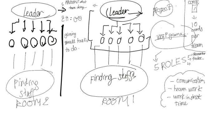
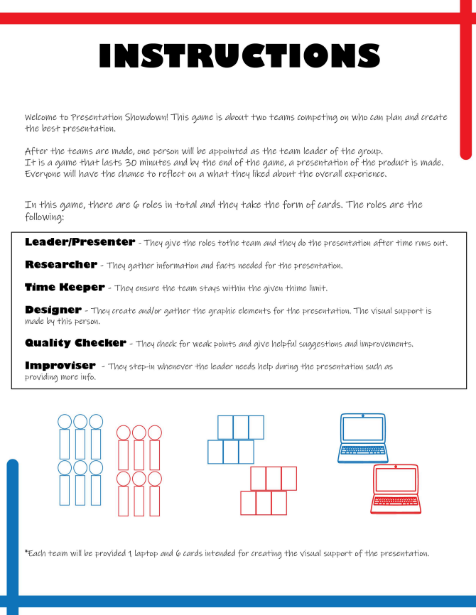
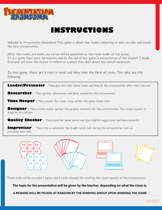
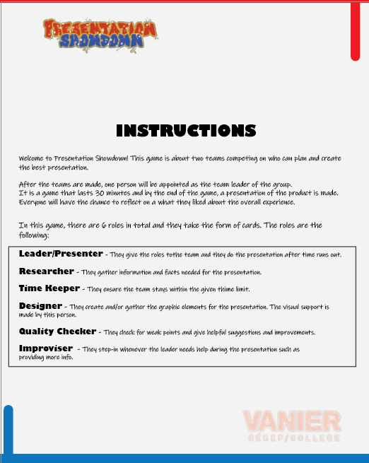
The project’s goal was to promote teamwork in the form of playing card games, while ironically
working as a team by making it fun, engaging and educational to the people who will have the chance to try
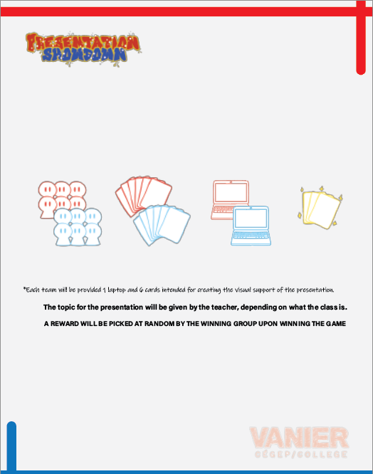
on our product. Overall, the project consisted of two teams competing against each other on who can
make the best presentation on a given subject within a time limit. Each member of the team will have a
different type of role given in the form of a card and will have to respect it to win. After the
game, members will write their experiences on a paper and the winning team can pick a prized card at
random.
My role in this assignment was to help my teammates by doing research on the types of games we
wanted to work around the teamwork theme and ultimately make the instructions for the game. Aside from that, I
also helped in designing a little bit of graphic elements in the game while making sure that we stay
within the colour palette decided amongst the team.
Like any other assignments for this specific class, we only had 1 whole week to work on it – we
needed to come up with the theme by the end of class on the first day, we needed to give a prototype of the
game by the 3rd day and gather feedback from peers and teachers and ultimately have the final
product ready by the 7th day.
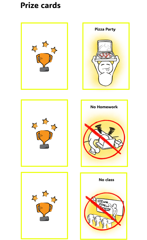
The problem we encountered with this specific project was the lack of prizes at the end of the game
as we realized that it felt like a school written homework with the questionnaire given after playing
the game.
For the target audience, we decided to dedicate the game to Vanier students to promote teamwork and
collaboration.
We wanted to create a game that involved cards and teamwork as we felt that college students like
playing with them as a form of entertainment. As for the game itself, each member of the group
contributed by making a brainstorm on the possible game until we found the most appropriate, unique
and interesting looking concept.
On an iPad, we drew an overall look at how the game works and after that, we did our own parts
individually. Given that Vanier has an overall red and white colour palette, we revolved our product
around that and added blue as another colour to the mix.

For my part, I explored ways of making the design of the instructions in Adobe Illustrator itself as
well as fitting in the text contents that go along with them.
In the initial design of the game instructions, the logo of the game’s name was not present,
therefore I added it in the final design, because we needed to know where the game originated and that it is not just a random game created by anyone. The graphic elements were also improved as opposed to the initial
design. Additional information was also added at the bottom of the final design because we added the prize
cards, which did not exist beforehand.
On the other hand, I had the opportunity to improve this project in the portfolio that we had to do
for that class as it was one of the requirments for the portfolio. The changes I made involving the instructions are making a front and back version of
it because I found that putting all the information of the game in a single page can be overwhelming to
people reading it, therefore, I made more space by making two separate pages. For the sake of this case study, I will mostly stick to the final version that my team and I submitted to the teacher.
For this project, I used Adobe Illustrator as mentioned, and I used Figma to work with my teammates
in real time to make it easier and faster to combine all our parts when it was time to export the
project as a file.
The following link sends you to the Figma file where we have included the final version of Presentation Showdown:
We added prize cards to the game to make it more interesting and engaging to the players. The prizes include throwing a pizza party, skipping homework and having no class. One of these cards may only be picked by one member of the winning team as a prize. The colourful graphic elements of the product certainly are the main highlights of what makes the design effective and engaging. The game concept itself is also unique and fun.
Upon showing our peers and teacher the product, we made (Presentation Showdown), they liked the idea
behind having two teams compete against each other in a school setting on who has the best
presentation. Overall, they think it was well made and thought of.
I found that the game became more interesting and fun when we added the prize cards, prior to not
having it at all.
On this project, I learned that making a game for school can be fun and can be used to promote
teamwork on campus. Students are often stressed out with their academic life that they often forget to play.
Therefore, games like Presentation Showdown can be a good stress reliever.
In conclusion, this school project was about making a card game that revolves around the theme of
teamwork, and this promotes people working together to meet a common goal of winning by having the
best presentation within a limited amount of time. It was a game that was done by 5 people, including
myself, and my main task was to help create the game instructions and a little bit of graphic elements.
For the Interacting in the Workplace class, we made similar projects that have the same 1-week
deadline, so we were used to communicating and working as a group.