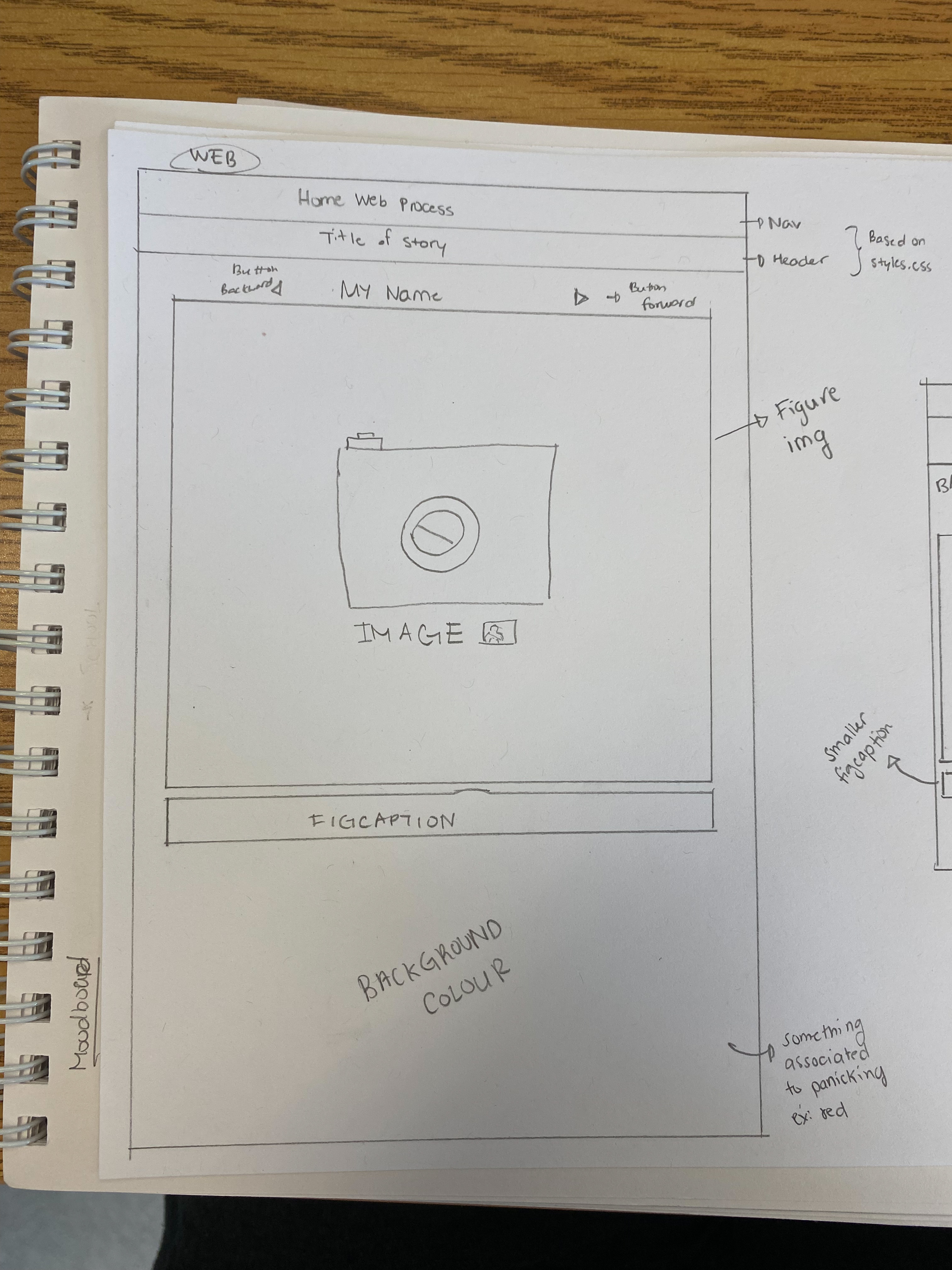
For the web layout, I have a resetstyle.css that is responsible for setting up the navigation bar and header
of the page.
I wanted to center the main content of the page, which are the images by using the figure element.
On top of that, there are two sort of buttons that the user can interact with in order to either go
forward (right arrow), or
go back to the previous image (left arrow). At the bottom, there is a figcaption for each image that
basically states what
is happening. I was also thinking of putting a background colour that is relevant to the story; since
the story is about someone
panicking after oversleeping, there is an intense feeling around that and I believe the red colour is
perfect for conveying that sort of emotion.
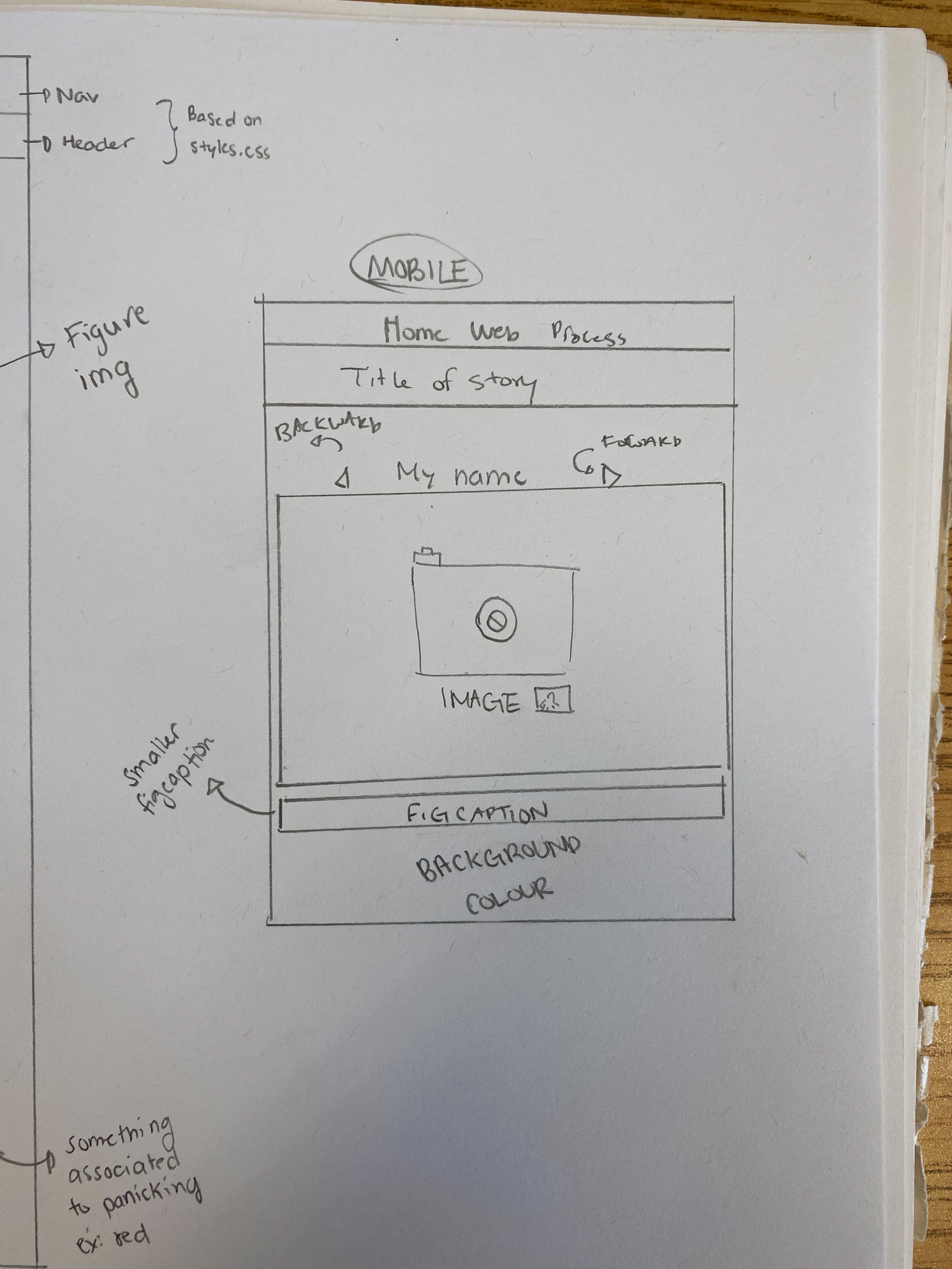
As for the mobile layout of the site, I wanted to make it similar to the Web version. Most of the elements
like the background colour are
kept the same, but some stuff like the figcaption will have to edited so that it's not too big to the
user's phone screen and to avoid
overlapping text.
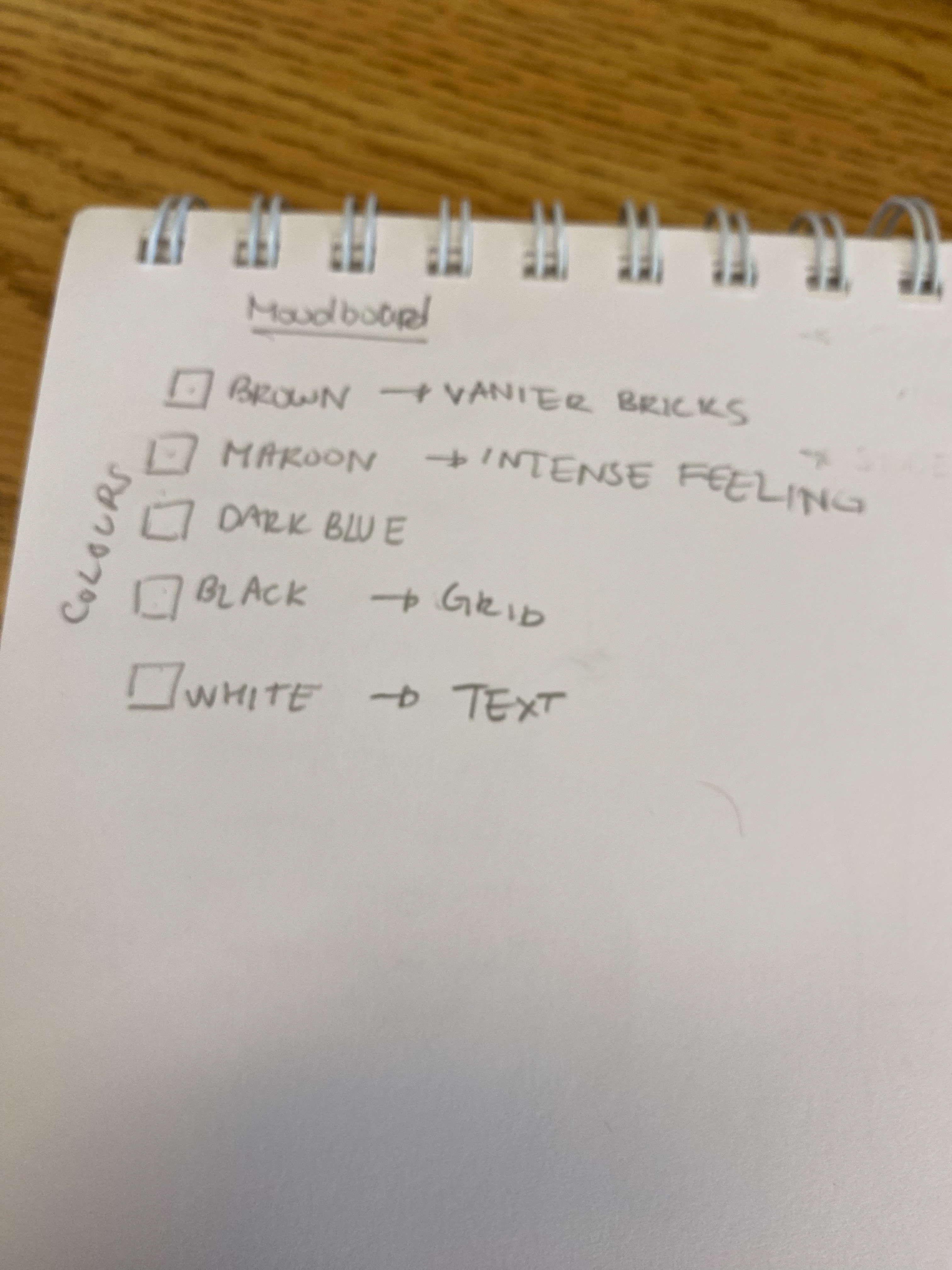
I have a few colours in mind for the moodboard. I wanted to use brown for the bricks of Vanier (because the
story is
happening at the campus), maroon (red) for the entense feeling of the character in the story, black for
the border of the text, and white
for the figcaption itself. I wanted the website to have some kind of Vanier vibes
My HTML file has a header and inside of that includes the title of the storyboard. I created a section
element with the ID=storyboard and it wraps the article element with
the article element in which has all of my 30 images. I do have two arrow icons that represent "back"
and "forward" and they are inside the nav element.
For the article that wraps my images, I named it "board", and for each picture, they are figures with a
figcaption.
I used two CSS file for the Storyboard website; the first one being the resetsyles.css and other one is
responsible
for styling my html elements for the site. It's where I changed the colour of the background to maroon
red.
I also animated the images by using keyframes. I put an id for the images that I want to animate in the
HTML file of the site
and I called the IDs in the CSS file.
I wanted my javascript to go back and forth whenever the user clicks on the arrows. Whenever it does a transition to the next image, it should make the image center just like the previous one. The transition is based on the width of the image * the index
Person 1: Woah
Person 2: It's always the 8AM classes...
Person 3: Story is good, just the transition is a little messy