For this project, we were given the task to make wine labels for one of the given companies by our teacher.
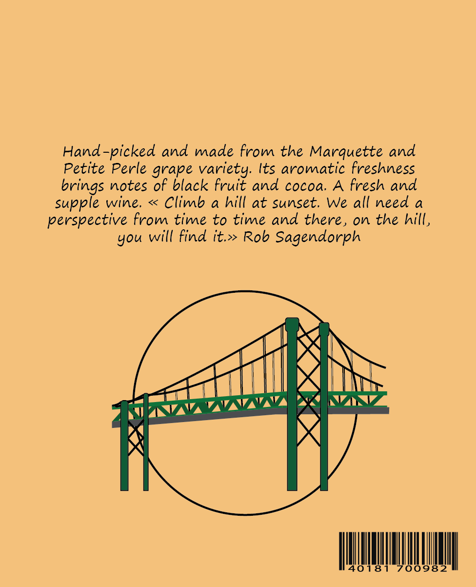
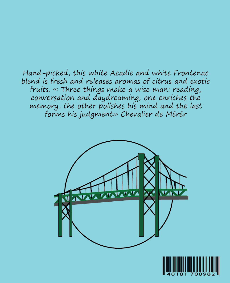
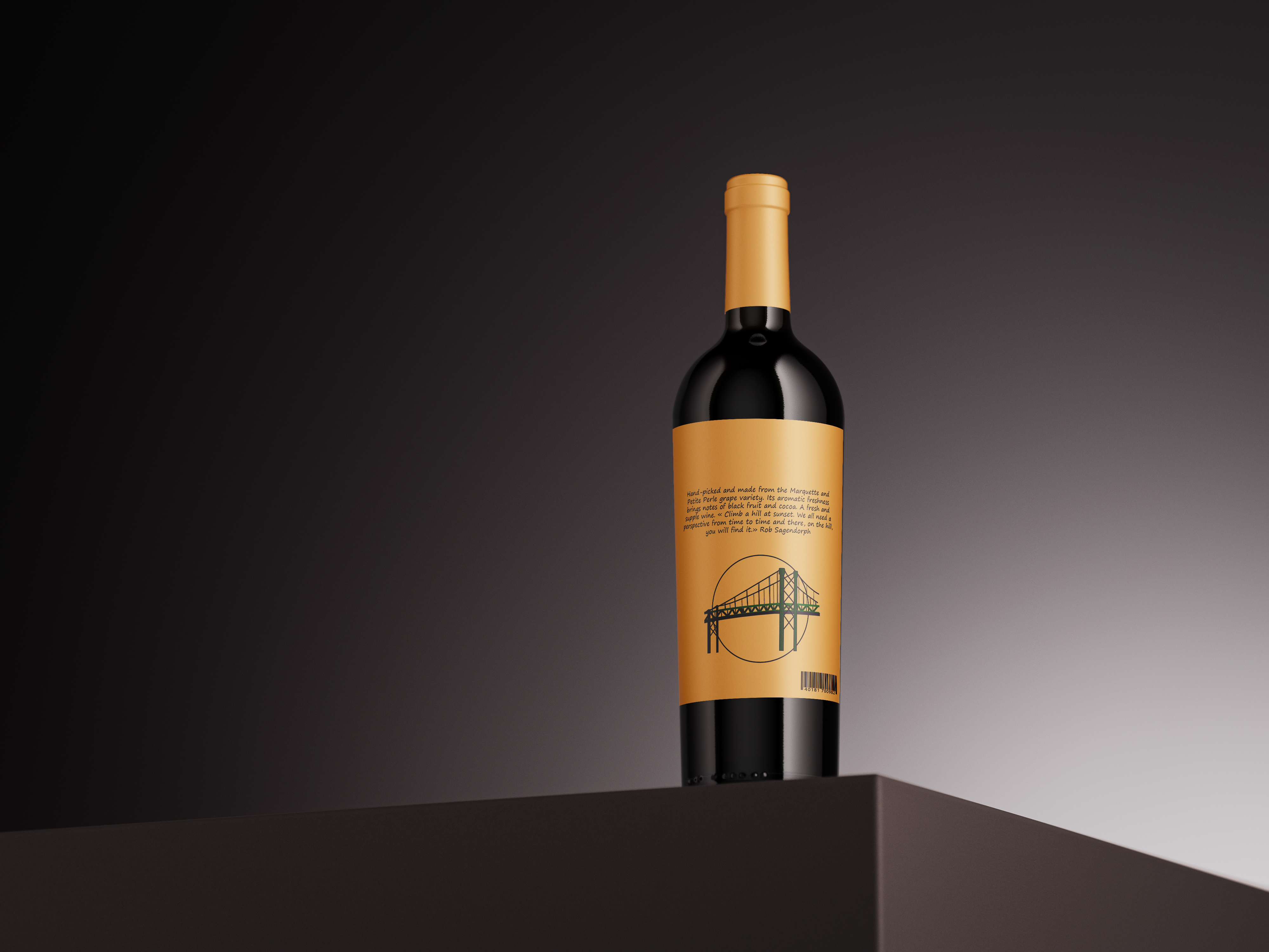
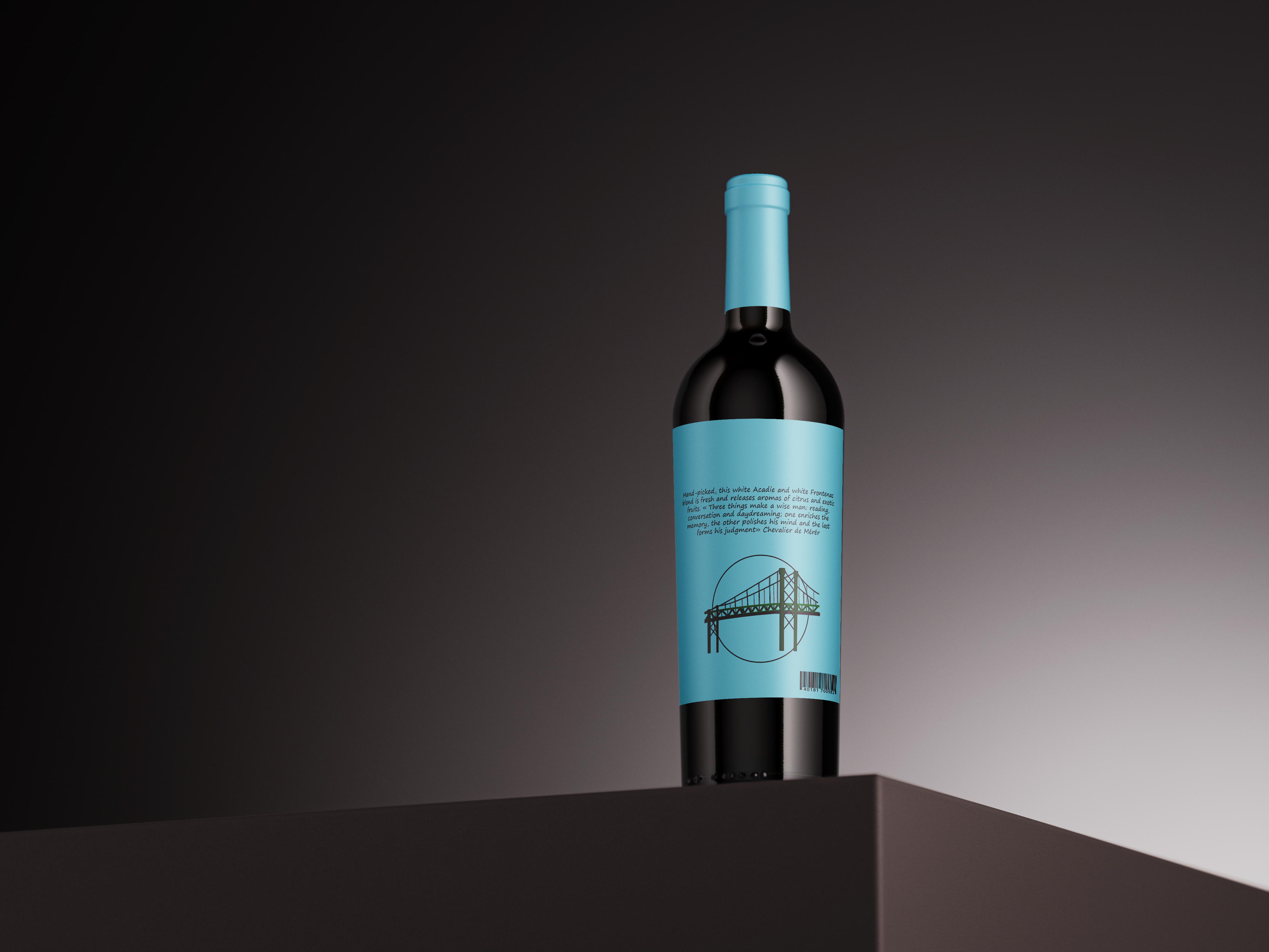
We needed to add the name of wine, the type of wine, the alcohol percentage, the year, region, volume at the front, as well as the wine description and barcode at the back of the wine.
After finishing the labels, we had to do a mock up with a wine bottle and ultimately print the labels and actually use them on a real wine.
December 2023


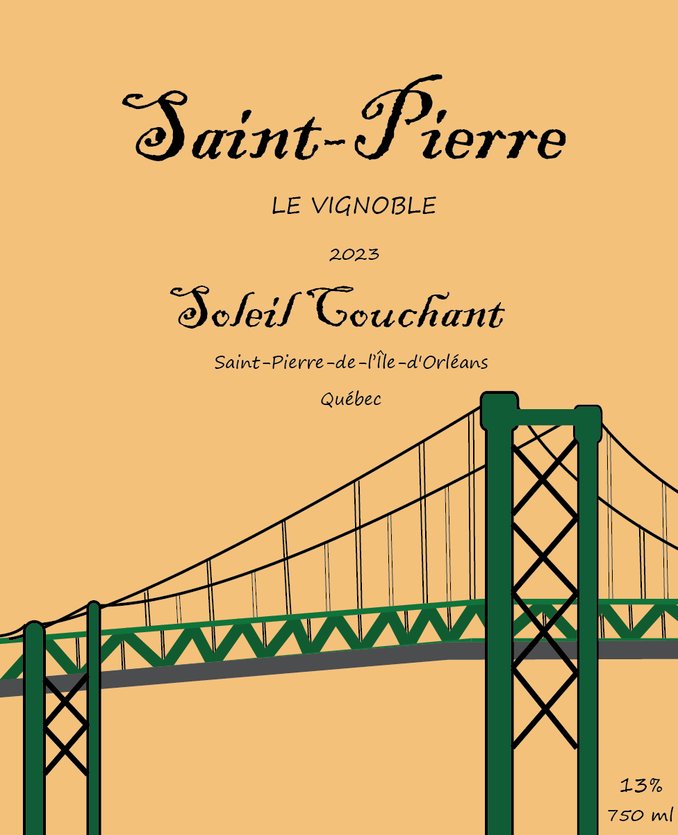
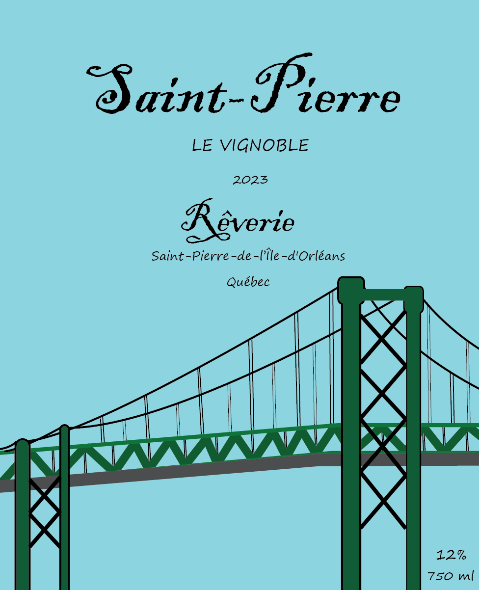
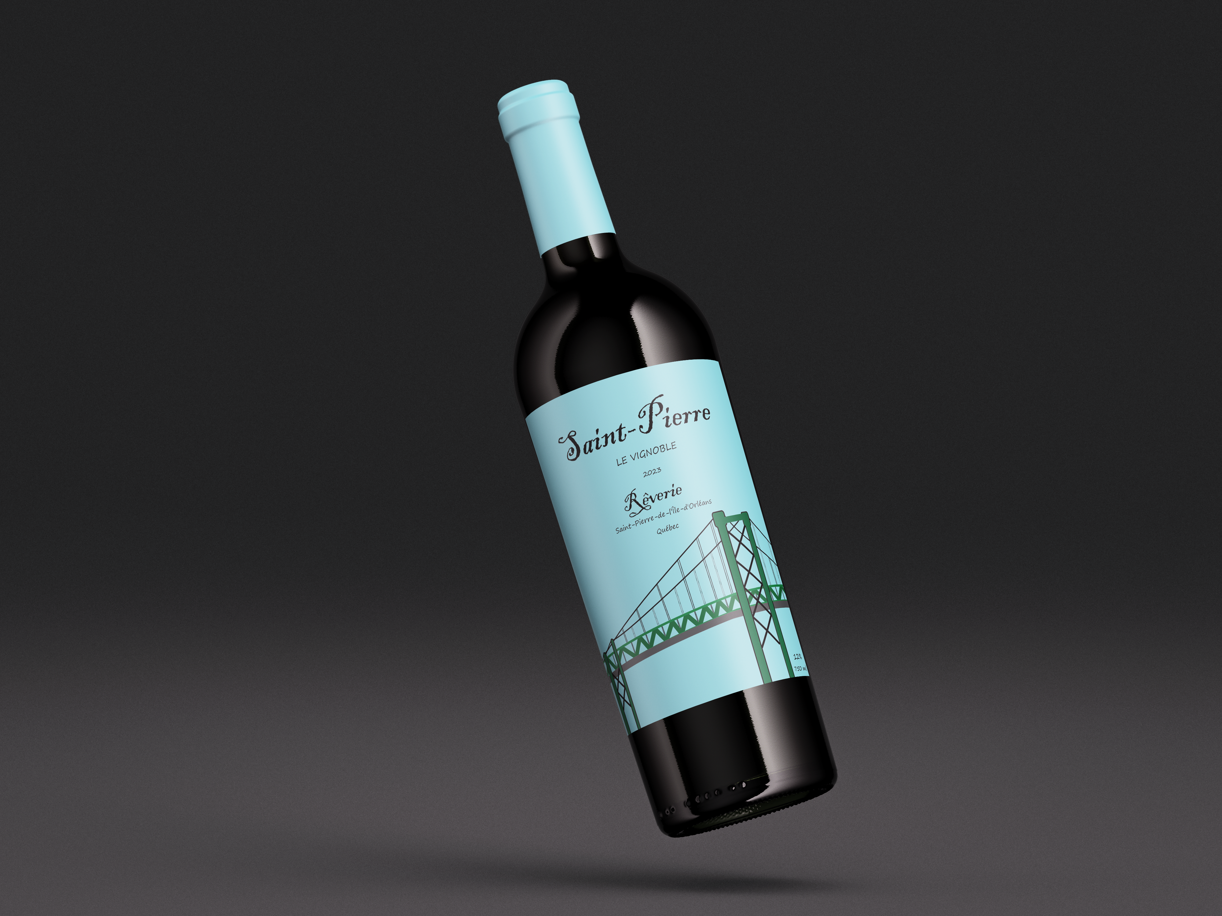
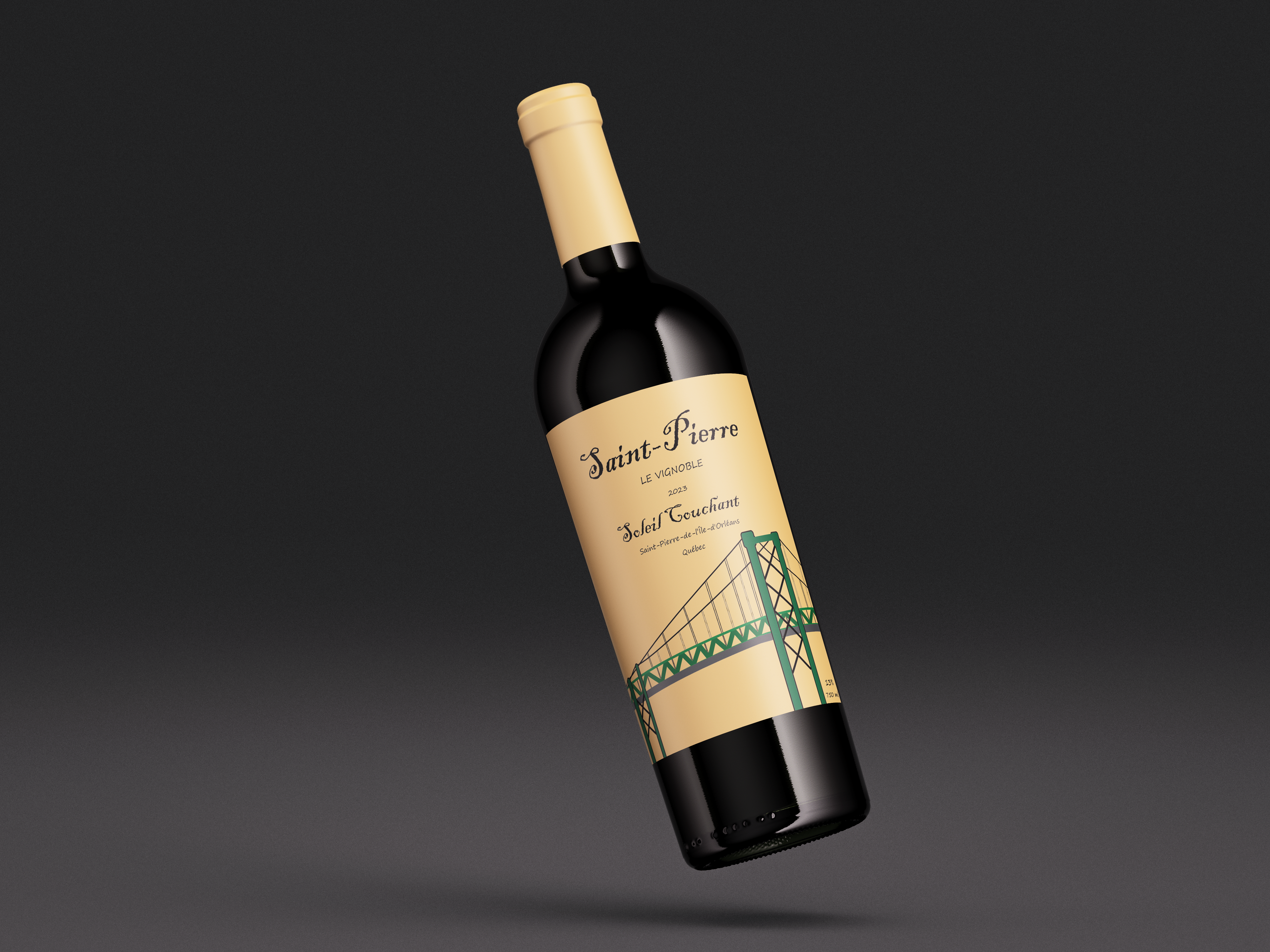
I decided to do the wine labels for "Sainte Pierre Le Vignoble" and it is situated in the Island of Orleans, in Quebec.
In terms of concept, I chose to use the bridge of the island as the main graphic of my wine label as it is an iconic landmark.
I chose the colours of the overall label based on the type of wine it was - Soleil Couchant relates to a hotter colour palette, whereas Rêverie is on the colder side.
The challenging aspect of this project would be the hierarchy of the overall content of the label as I do have to take into account what a real wine bottle looks like and place them according to the norms and standards of the specified type of bottle.
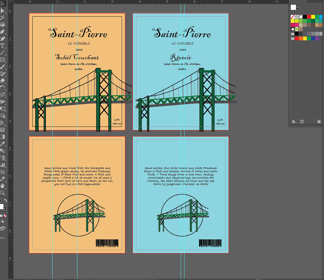
I decided to work with two different fonts - a fancy and cursive font, and a neutral font.
I used the cursive font for "Saint Pierre" and the type of wine it is (e.g. Soleil Couchant), while the latter is used for the rest of the information of the wine like its description and the location.
The texts that use the cursive fonts make them look visually pleasing to the eyes and give the impression of being the main information of the bottle.
Most of the texts are placed on top, besides the alcohol percentage and volume, while the graphic image is placed on the lower half of the label. The same thing can be said for the back side of the label.